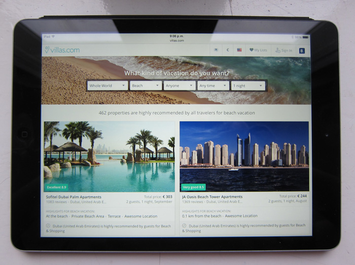
Holiday Finder Case Study
2014 - 2015, Lead Designer
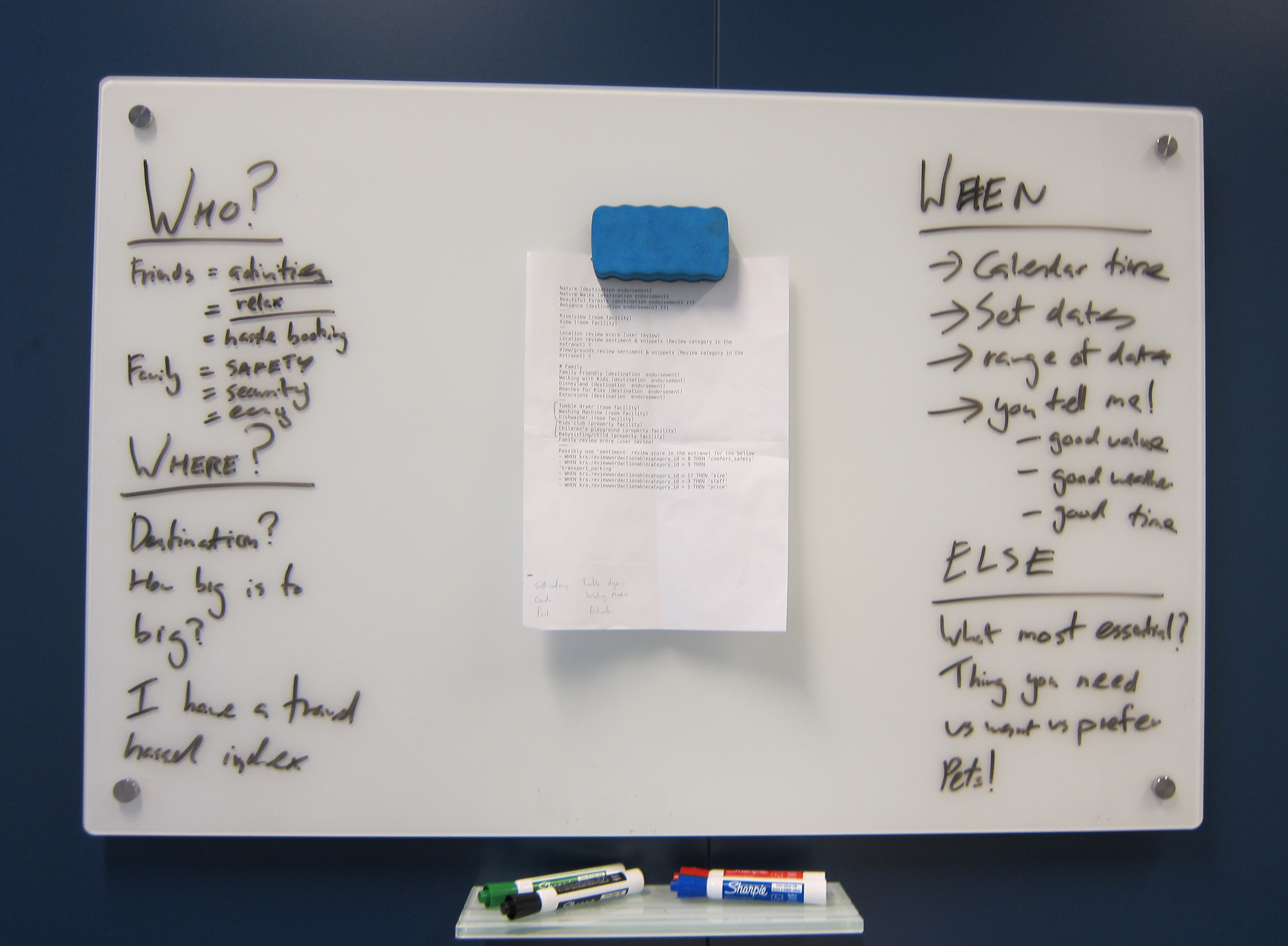
One of the initial whiteboard sessions
Intoduction
In March 2015 I started working on a hackathon project that went on to become known internally as the ‘Holiday Finder’. Our hackathon work was received well internally and we got the backing of the business to spend a month building out an MVP. As the lead designer on the project I learned a lot over the course of one intensive month on the way toward our launched MVP. In its still short life, the ‘Holiday Finder’ has helped 10’s of thousands of people find and book properties perfect for them.
Origins of the idea
While working as the lead designer on Villas.com, I had many conversations with our users during both user testing and focus groups. During these sessions I began to see a trend: the way people searched for homes and apartments was often very different than hotels. For these types of properties people often started with the experience they wanted to have. Whether it be relaxing by the pool with friends, enjoying the beach with the kids, or getting cosy in a countryside cottage—these were people’s first principles. Dates and destinations were secondary. Experiences were primary. I started to wonder, could we create a product that allowed people to search by holiday experience?
2 days of hackathon
After having a few discussions about what a holiday experience search product might look like, I wanted to explore it further. I found a colleague interested in helping out (Hinrik, a backend engineer), and we worked during one of Booking’s monthly hackathons to build the basic idea. We had just 2 days, so we set ourselves the goal of answering the 2 main questions we had: is this something people actually want, and is this something we could actually build?
Guerrilla market research
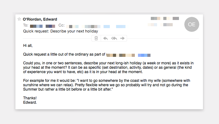
To see if this was something people wanted I started some guerrilla market research. I wanted to flesh out (and hopefully back up) what I had seen in user testing previously. Were there a large amount of people who thought about their holiday primarily in terms of experiences rather then destinations?
My first step was to send an email to everyone in the department asking them to describe their next holiday in a few lines. I was interested if the patterns we had seen previously would be replicated in the responses we got.
Trying to do a bit of market research
After going through almost a 100 responses I began to see consistency in the way people described their holidays. What was important was who they travelled with, when they could go, and (excitingly for me) what experience they wanted to have. While some people had a particular destination in mind a large number were primarily focused on holiday type or experience rather then a set destination.
Our next step was to flesh out what types of holiday experiences our users wanted. I had the responses to the email I’d sent, but I was interested to see if I could use a (much!) larger data set to gain more clarity. With the help of a data analyst, I looked at the types of destinations our vacation rental customers visited and what sorts of reviews they left. We found that while there was a lot of variation based on seasonality some clear trends stood out: beachside, countryside, lakeside, and ski-trip vacations were the most popular. While obviously still inconclusive, we had enough evidence to think that, indeed, people did often think about holidays in terms of experiences rather than destinations. We also had a rough model of what sorts of holiday experiences were important to our users.
Now we just needed to figure out if we could build it. 😀
Algorithm to find properties
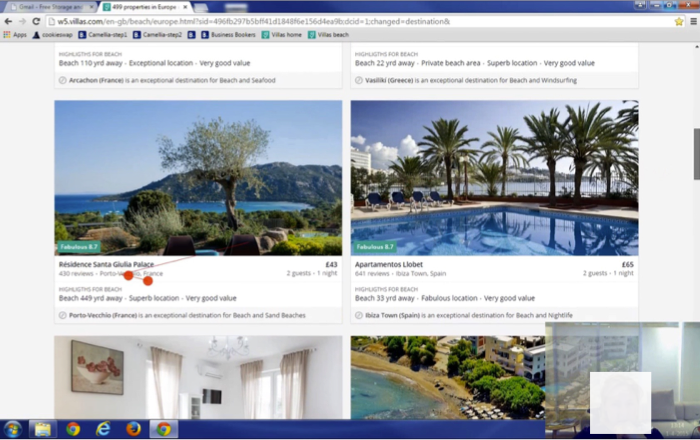
We needed to figure out if it would even be possible to find properties based on themes rather than destinations and set dates. While Booking.com used to let owners tag properties with themes when they added them to our platform, we no longer allowed this (due to inconsistency in the data entered and because the previous system was open to abuse). We also didn’t, at the time, let guests tag properties after their stay. As such, we needed someway to find and surface properties that were indeed great for beach holidays, perfect for a lake-side family trip, and more—without any obvious way to go about it.
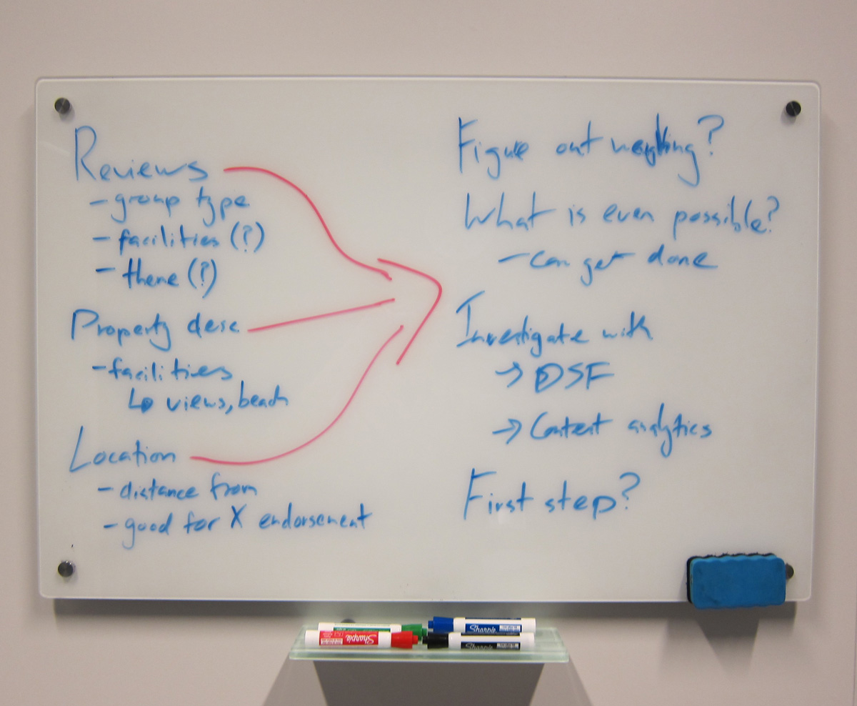
Whiteboard session on algorithm design
After a lot of coffee and a bit of trial and error we settled on an approach that combined:
- Destination information (how far is the property from the beach or lake?).
- Guest reviews (how highly is the property rated by families? What types of holidays do people usually take in the destination the property is in?).
- Property facilities as proxies for suitable property types (does the property have beach access, lake-side views, etc?).
We experimented with the various weightings these attributes should have and we discovered that we would have to tailor it to different types of thematic searches. But we finally had some working code that was giving relevant properties based the a ‘beach’ holiday experience. Awesome! 🎉🎉🎉
With another day left in the hackathon we moved on to the next stage. While Hinrik worked more on fleshing out the infrastructure to develop the algorithm, I began work on figuring out what the UI might look like.
UI Basics
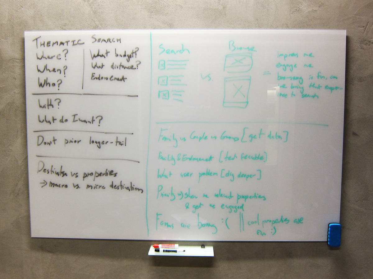
I'm an admirer of Bill Buxton's ideas regarding the design process as a cycle of elaboration and reduction (as outlined in Sketching User Experiences). First you generate lots of new ideas and immerse yourself in the problem space. Then, when satisfied with this period of elaboration, you work over time to distill these insights and progress toward a solution. For the elaboration phase I gathered together a group of designers. Together, we sketched and asked questions like: what sorts of flows should I explore? What sorts of users might the product attract? What sorts of tools would people need to help them find properties? And, what sorts of content should be displayed about properties we showed?
One of the elaboration whiteboard sessions
After this elaboration session, I wanted to give our ideas more focus. I sourced some data on the types of people we saw booking vacation rental properties and created two very basic personas: John (traveling with his partner) and Jane (traveling with her family). As a group, we sketched out some job stories based on how John and Jane wanted the product to help them. For instance, they would want it to explain what the product does when they first land, and also help them look for properties suitable for their holiday type, group, budget, and time frame. (Job story approach inspired by this blog post by Intercom).
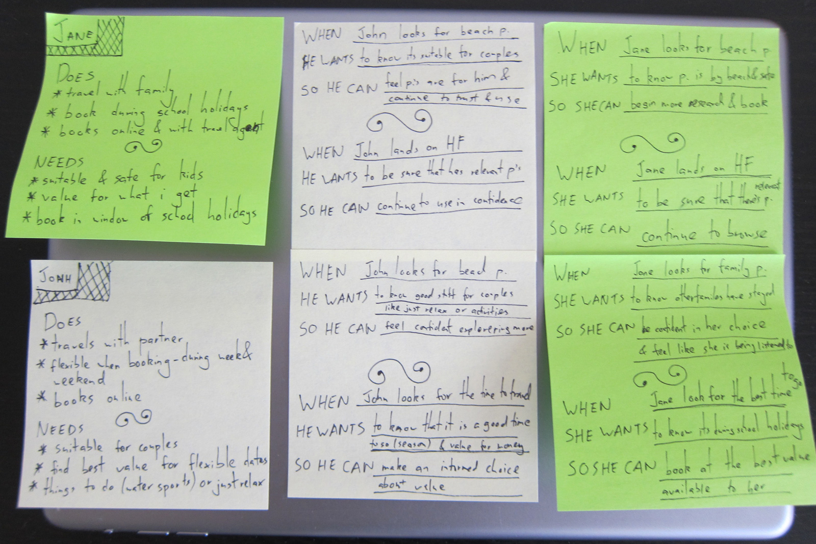
Some of our job stories
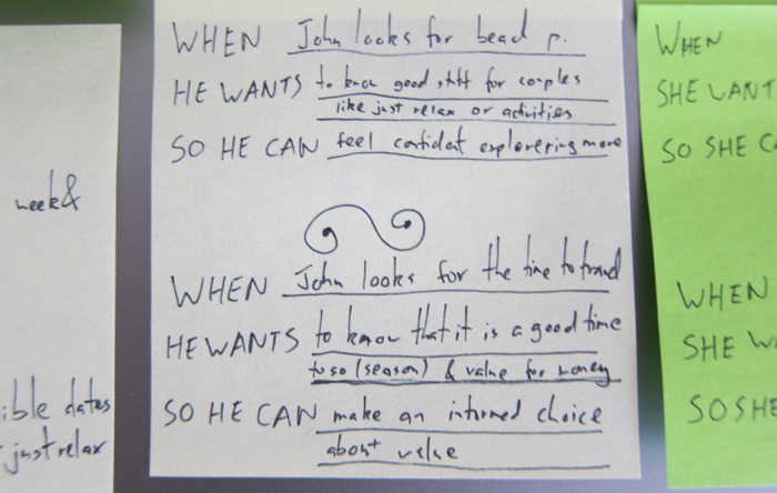
Some of our job stories
Getting feedback quickly
I like to work to create quick feedback cycles as early as possible in the design process. The goal of most design deliverables should be to get an idea out of your head and into a form on which you can receive feedback as quickly as possible. As such, based on this group session, I created a very quick wireframe. As I knew that tablet and ‘desktop’ devices were the bulk of our existing traffic, I concentrated on these platforms. I then put this wireframe on to an iPad so I could walk round the building and ask for feedback.
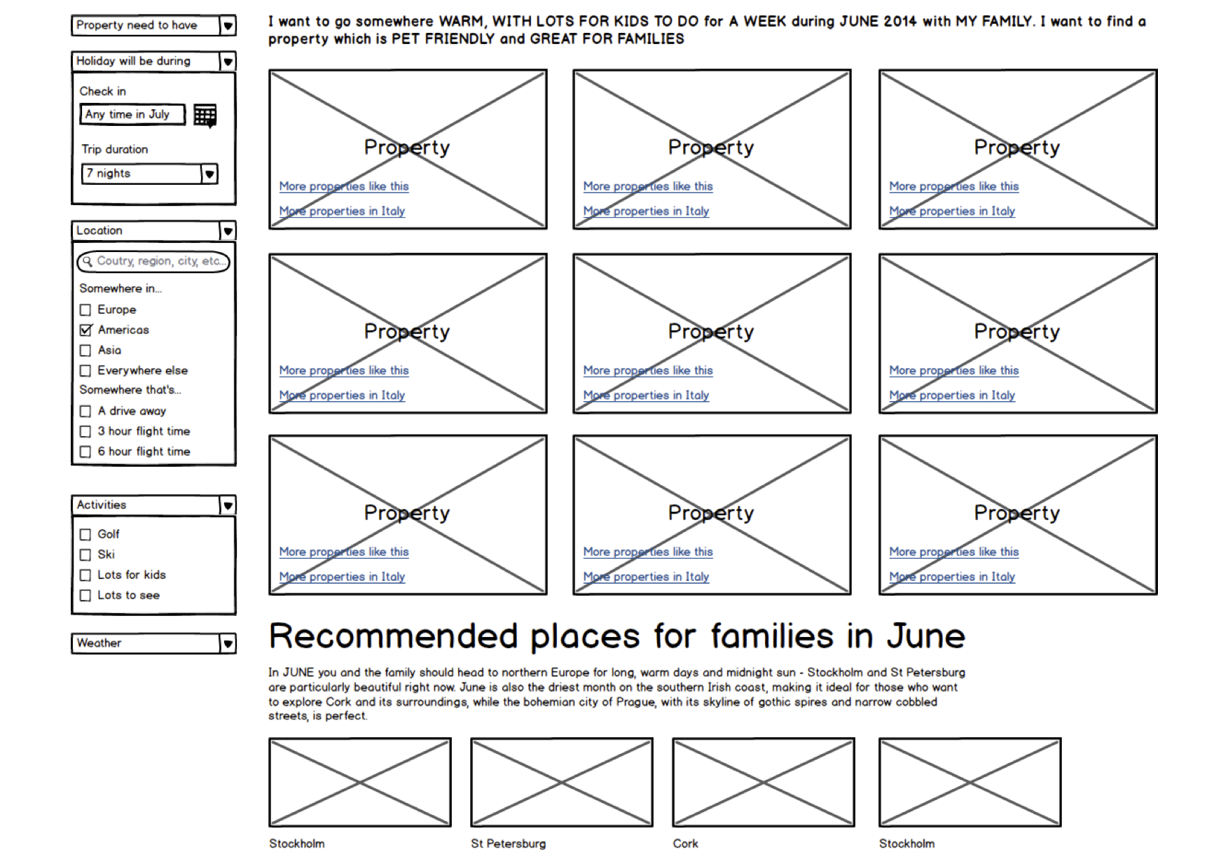
One of the very first wireframes
I knew there was a lot in the wireframe, but this quick, very imperfect mockup helped generate useful feedback on what I should keep and what I should take away. Based on this feedback, it became clearer what the most friction free flow was and what the most important things were. Based on this feedback, I created some new wireframes and flows:
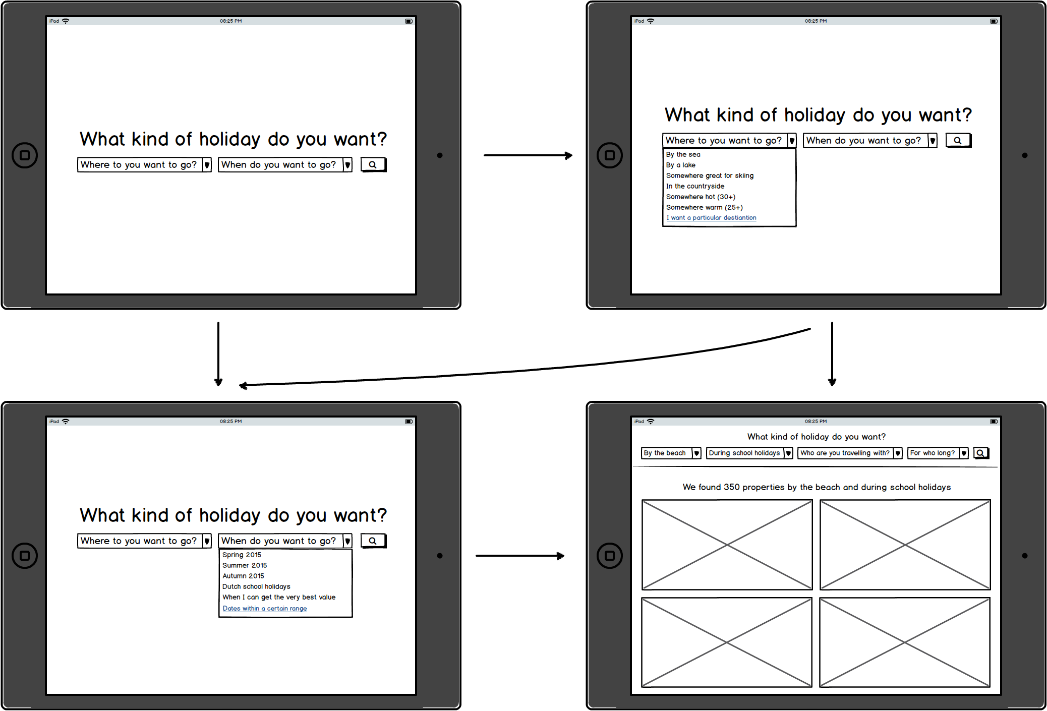
Main flow with screens
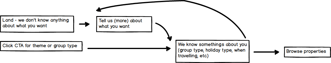
High level process flow
A little detail on some interaction
This process helped formulate our design principles for the project:
- Focus on the properties. I came here to view properties, put them front and centre.
- Forms are boring, interesting properties are fun. Don’t make me fill a lot of information to get started.
- Talk to me. Based on what I enter tell me why your recommending this property.
Hinrik and myself had come a long way in 2 days, but we knew if we wanted to get some more resources invested in the project we would need a working prototype. While Hinrik had got some working code which could return interesting properties, we didn’t have any visual design to show off his great work. I spent some time hacking over the weekend and created some initial visual designs. A little later that week, after a few late evenings, we had a working prototype that we felt we could pitch internally.
Showing my wife the prototype
Getting the support of the business
After sharing the prototype, we were excited to get the chance to pitch the project to some senior people in the department. Despite our nerves, this went well and we were given 4 weeks of resources to build out the project into production. This was awesome, but it also meant we had some big challenges ahead. Our prototype was very basic, only taking holiday type into account when suggesting properties (not group composition, or time of travel, etc). Also, we hadn’t had a chance to validate many of the UI ideas we had implemented. We knew a few rounds of iteration were in order.
We decided our process would focus on getting a steady stream of working prototypes so that we could make product decisions based on people actually interacting with it. Because we were creating something a little bit out of the ordinary, we knew it would be hard to get a real sense of the product from wireframes and Sketch mockups.
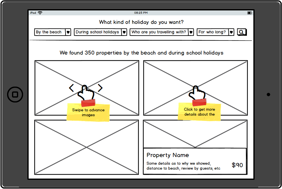
That said, there were still a few things I wanted to figure out regarding what content was relevant to people. As such, I spent the first 3 days getting clarity on the fundamentals of the design. I did this by quickly creating Sketch mockups, putting them on an iPad, and walking round the office asking questions like: “What does this do?”, “Does this make sense?”, “What would you expect to happen when…?”. I repeated this process about 5 times over the course of 3 days.
One of the Sketch mockups
From this process I came to a few conclusions:
- Originally I had wanted to combine destination and property information on the same card, but people found this quite confusing. Some destination information was OK, but too much led to confusion regarding what the card was supposed to represent.
- I had wanted to include some sort of image links at the top of the UI that would create a simple, ‘browse-able’ experience where users could tap on something they liked the look of and see similar properties. While people commented positively on this feature, their ideas about what would happen next varied quite significantly. The exact flows that this feature would introduce were not clear. While I really liked the idea, it looked like it was going to be a potential distraction. So, I set it aside for the time being.
- People wanted the properties front and centre, but the way I had designed the original UI controls was too hidden. We needed to make their presence more obvious without distracting from the main focus of the experience: the properties themselves.
From this feedback I felt more confident building out the second version of the prototype and beginning further iteration from there.
Guerrilla usability testing the prototype
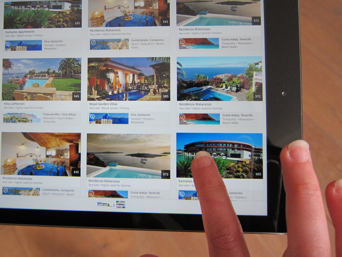
Both the backend and front-end work was continuing quickly. We were adding new features and functionality every day. During this development process, I was keen to keep things as flexible as possible and continue to user test the features we were adding and UI decisions we were making. I continued the same process I had undertaken with wireframes and Sketch mockups: I put the current state of the product on an iPad and asked people to use it.
Our work in progress
I was anxious not to confine feedback to the technologically savvy folks around me, so my travels brought me to Booking’s post-room, reception, cafe, and even the streets of Amsterdam. I got lots of great feedback that heavily influenced the final design. Two of the bigger things that significantly influenced the product direction were:
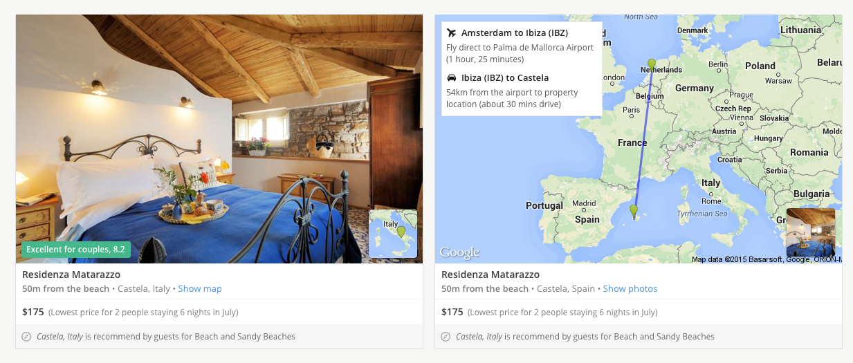
- Since we couldn’t rely on photos to convey that a property was particularly “beach-y” or “lake-y” we needed to be sure that we gave confirmation in the design of the card and detail the reasons why we had chosen these properties.
- We had developed a feature that would let people specify when they were going to travel and how long they wanted to stay. This let us find the very cheapest price for them to stay at all the properties they were viewing. Unfortunately, most people didn’t understand that the price we showed them was the cheapest on offer. Even though it made the design less clean, I was happy to make the trade-off as it meant people now understood the great deals the product was surfacing.
Formal usability testing before launch
With the end of our development cycle approaching and the MVP fast coming together, we wanted to do some more traditional usability testing in our user research lab. We invited 5 participants to come and use the product.
Video capture of user testing
We were delighted to see people respond positively to the product and that for many of the participants it met a real need. The process gave us confidence in our MVP and also highlighted numerous ways in which we could improve the product post launch. The number one requested feature was to have some way to only show properties within a certain travel range (“the property might be great but I’m not going to spend 12 hours on a plane with my kids!”). It was clear we needed to give people some practical information about how they would get to the property. While we didn’t have time to include this functionality in the launched product, I did some follow up design work based on the same quick iteration cycles and I'm excited to build out this functionality further.
Design ideas informed by usability testing
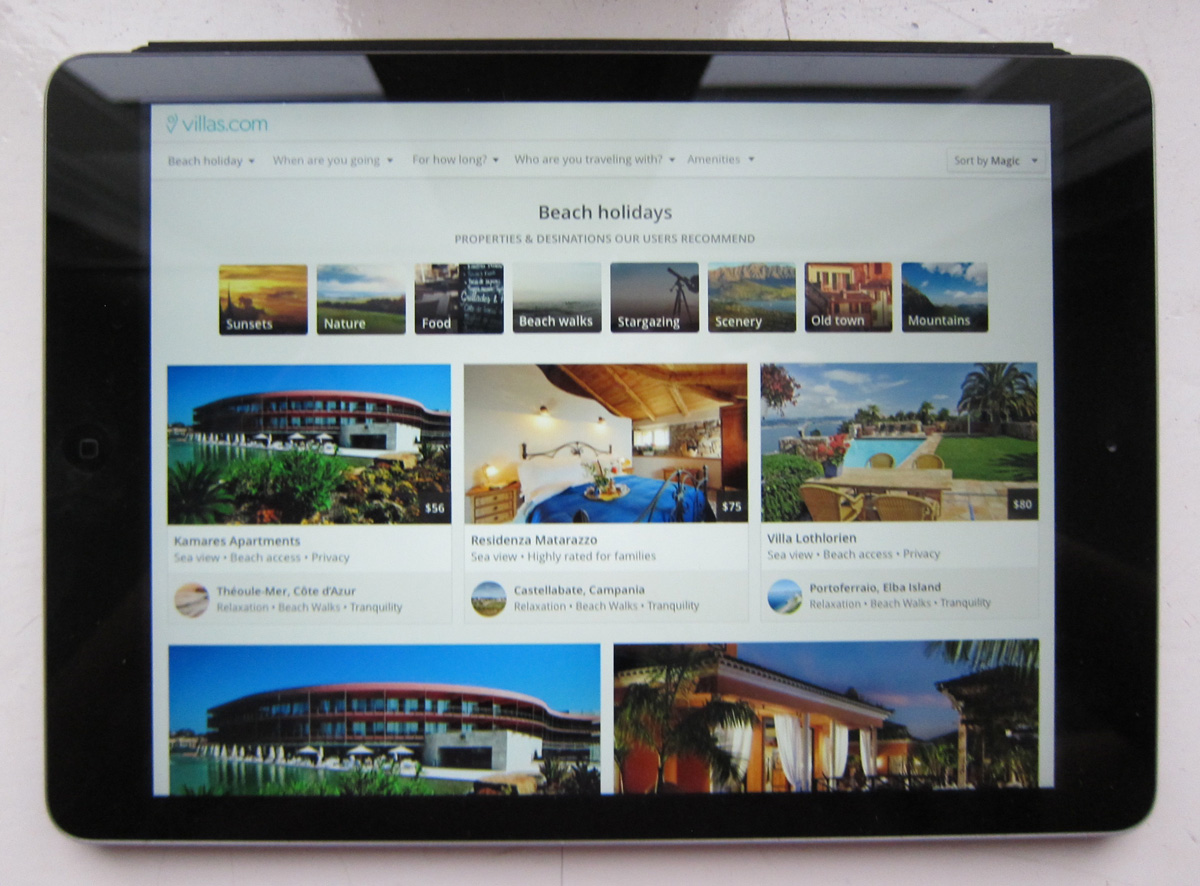
Launch
After an intense 4 weeks, we shipped an MVP that we were happy with. We knew there was still plenty of work to do, but we were satisfied that we had a solid starting point upon which we could iterate further.
Everything went so well, I even got to show it off as the featured project in a video that Booking.com’s recruitment team put together about the company’s hackathons. It was my first time speaking to camera, which is why I look pretty nervous—I’ve got to remember to smile next time!